The Popular Dictionary of Saudade
The Popular Dictionary of Saudade
How many words can fit inside seven letters?
The Popular Dictionary of Saudade is a 592-page book dedicated to a single word. The project began in New York in 2016 as an attempt to explain saudade to people who did not have the word in their vocabulary. Over the following ten years, it grew into a collective investigation shaped by conversations, memories and research, culminating in a dictionary in reverse: hundreds of voices and perspectives gathered to explain a single word.


The project’s visual identity began with a custom lettering drawn in 2016. Built from contrasting letterforms inspired by old printing types, it reflects the imperfect, nostalgic and layered nature of saudade itself.


Rather than searching for a definitive meaning, the project brings together personal memories, cultural references and different ways of experiencing saudade. Each contribution adds another layer to a feeling that is intimate, collective and constantly evolving.


The book combines essays, interviews, chronicles and popular definitions collected over a decade, presented through a visual language inspired by concrete poetry. Its editorial design uses typography, repetition and space to give visual form to memory, distance and absence.


Nu Sans
Nu Sans is Nubank’s first proprietary typeface, created to translate the brand’s values into a human, expressive, and highly functional typographic system. Inspired by the curves of the Nubank logo, it brings clarity, accessibility, and consistency across products, communications, and markets. Learn more about the project on the Nubank blog and on Blackletra’s website.

Nu Brand Refresh
As Nubank evolved into a multi-product, multi-market company, its identity needed to grow with the business. The Brand Refresh created a more cohesive and scalable system, refining the brand’s most recognizable assets while introducing new tools to support its next chapter. Learn more about the project on the Nubank blog.

10 Year of Saudade
Created to mark the project’s tenth anniversary, 10 Years of Saudade revisits the custom lettering first drawn in 2016. What began as a series of posters placed on the streets of New York became the visual starting point for a decade-long investigation into memory, distance and absence.
My Role
Design
2016 – 2026
Design
2016 – 2026
The commemorative edition was produced through a manual letterpress process at Oficina Tipográfica São Paulo. Printed from movable wooden type on a 1929 KBA cylinder press, each of the 100 numbered posters carries the subtle variations and imperfections of its production.


Nu – 100MM Clients Celebration
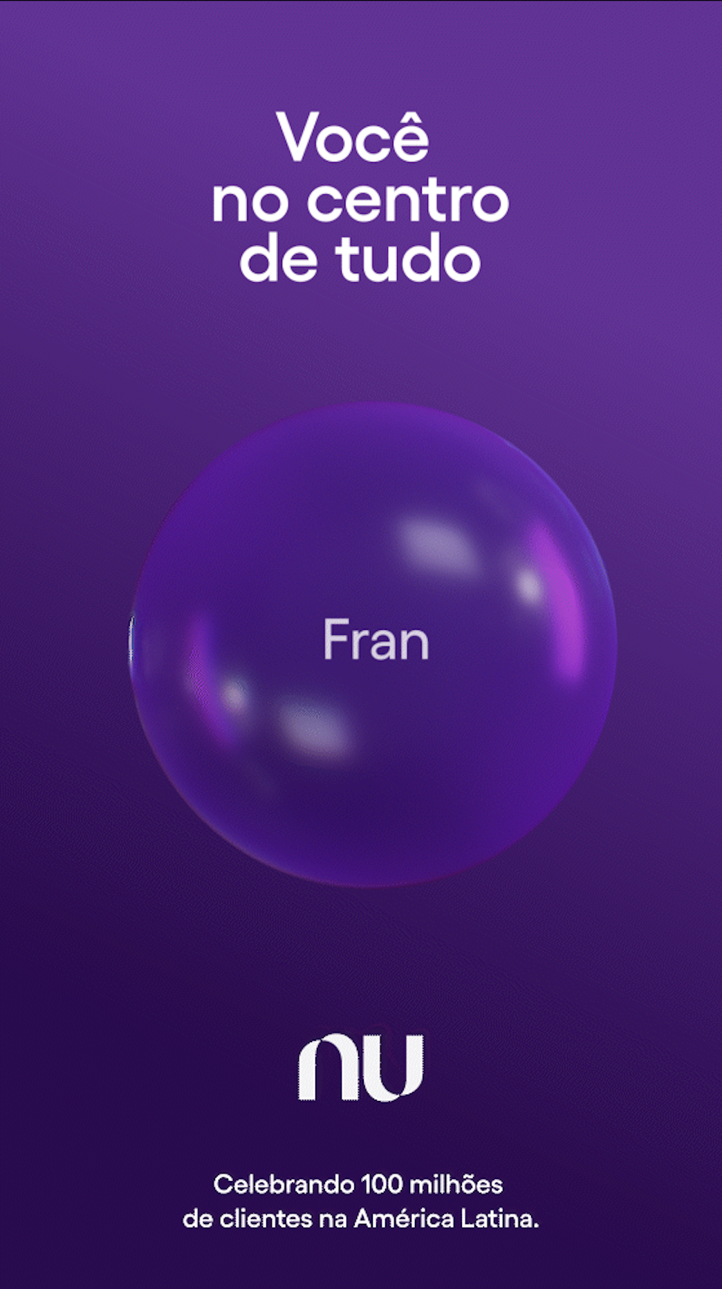
To launch “You at the center of everything”, a campaign that leverages technology and innovation to highlight real customers’ journeys through an activation on the Exosphere – the exterior of Sphere in Las Vegas and the largest LED screen in the world.
My Role
Creative Direction
Design Direction
Lead Design
Nubank
2024
Creative Direction
Design Direction
Lead Design
Nubank
2024

The Exosphere activation shows 360 degrees of images of Nubank customers on the exterior of the venue – which is nearly 112 meters high and more than 157 meters wide. The faces are formed by purple particles, each of which represents one of Nubank’s 100 million customers. Together, they illustrate that Nubank is composed of all their individual stories.
Sphere, Las Vegas.

Nubank customers were featured for a week at Exosphere, kickstarting additional local campaigns and customer engagement in Brazil, Mexico, and Colombia. Nubank’s 100 Million campaign materials are available at Nubank 100M.






Graphic Assets

Color Palette



Graphic
Ads
Ads